We still regularly get feedback on sites we design and build that’s motivated by client concerns that certain elements of content or functionality need to be higher up the page. This is because they don’t always have faith that users will scroll down to review the entire contents of a page.
‘The fold’ is an idea that’s carried over from print newspapers, where the most important stories would always be placed on the top half of the front page so they could be read without unfolding the paper. In the early days of the web, the fear that people wouldn’t scroll may have been justified, but no longer, and there’s ample evidence that web users scroll without much conscious thought.
Don’t just take our word for it though – here’s a selection of further reading for anyone who’s concerned about this issue:
- There Is No Fold, by Luke Wroblewski
- UXMythis, Myth #3: People don’t scroll
- The “above the fold” myth
- Debunking the Myth of the Fold
- ‘Above The Fold’ And Other Web Design Myths To Ignore In 2020
- Is Staying “Above the Fold” Still Relevant in Website Design?
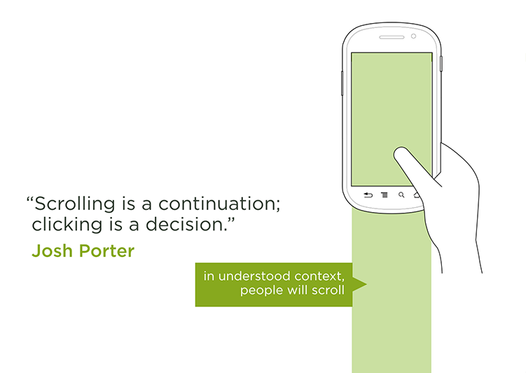
I’ll leave you with my favourite image from the above articles, which sums up the received wisdom: